AIR CANADA
Context
To celebrate a big milestone - Air Canada’s 80th anniversary and Canada’s 150th anniversary, Air Canada had huge ambitions to break into the top-ten of the world’s global airlines.
Challenge
At such a pivotal time in history, how does Air Canada reaffirm its position in the aviation industry and/to become one of the world’s top-ten airlines?
Insight & Strategy
Given Air Canada is the national carrier; we needed to reinforce a sense of Canadian pride by capturing and celebrating the modern Canadian spirit. We leveraged the country’s diverse culture and natural landscapes while paying homage to the airline’s rich heritage.
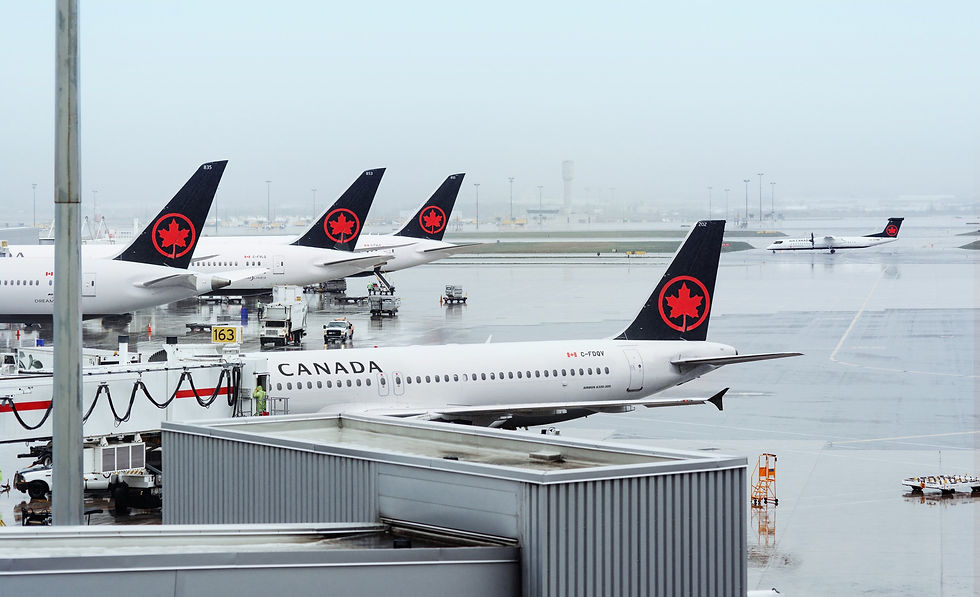
Creative Output
Transformed the brand's visual and verbal identity starting with the livery design across the airline’s mainline fleet and gave it a modern, contemporary look with a bold, clean, pure design with distinguishable features such as:
-
The iconic red maple leaf, bringing back the rondelle
-
The belly, clearly visible and standing out in the sky
-
The dark hue influenced by the frozen bodies of water of Canada’s vast nature
-
The nose mask on the cockpit windows are inspired by the facial markings of indigenous birds & wildlife representation in early native culture.
Instantly identifiable on planes & tarmacs, the livery design is a careful balance between representing the strengths of the company and the country.
It was unveiled in 3 cities simultaneously: Toronto, Montreal and Vancouver to all the AC staff, AC customers, aviation experts and press.
This redesign was then rolled out across a breadth of touchpoints and a range of supporting material (brand guidelines, OOH signage in airports (lifts), print ads, stationery, menu, airport signage.
Result
Allowed Air Canada to increase their turnover year after year
Record operating revenues of
$18,065 billion in 2018 up from
$16,252 billion in 2017 up from
$14,677 billion in 2016